When I started making jewelry, I primarily stuck to one color, in varying tones, or if I was feeling particularly spicy, I’d use a neutral color alongside that color. A few favorites included champagne and deep red, amber and teal, and black and aqua. After hearing someone tout the combination of deep red and teal, I decided to give it a whirl- whoa!

The ancestor of the Boho Mosaic bracelet! 
Whoa- deep red and teal does work together!
Old photo of layer necklace
I’ve always loved color, including playing with different color combinations. I vividly remember the curated collections of Crayola markers- Bold, Pastel, etc. I sometimes do crayon mandala drawings, where I doodle mindlessly and color with an array of Crayola crayons. Some colors are still part of the collection, while others have been discontinued over the last 20 or 30 years.
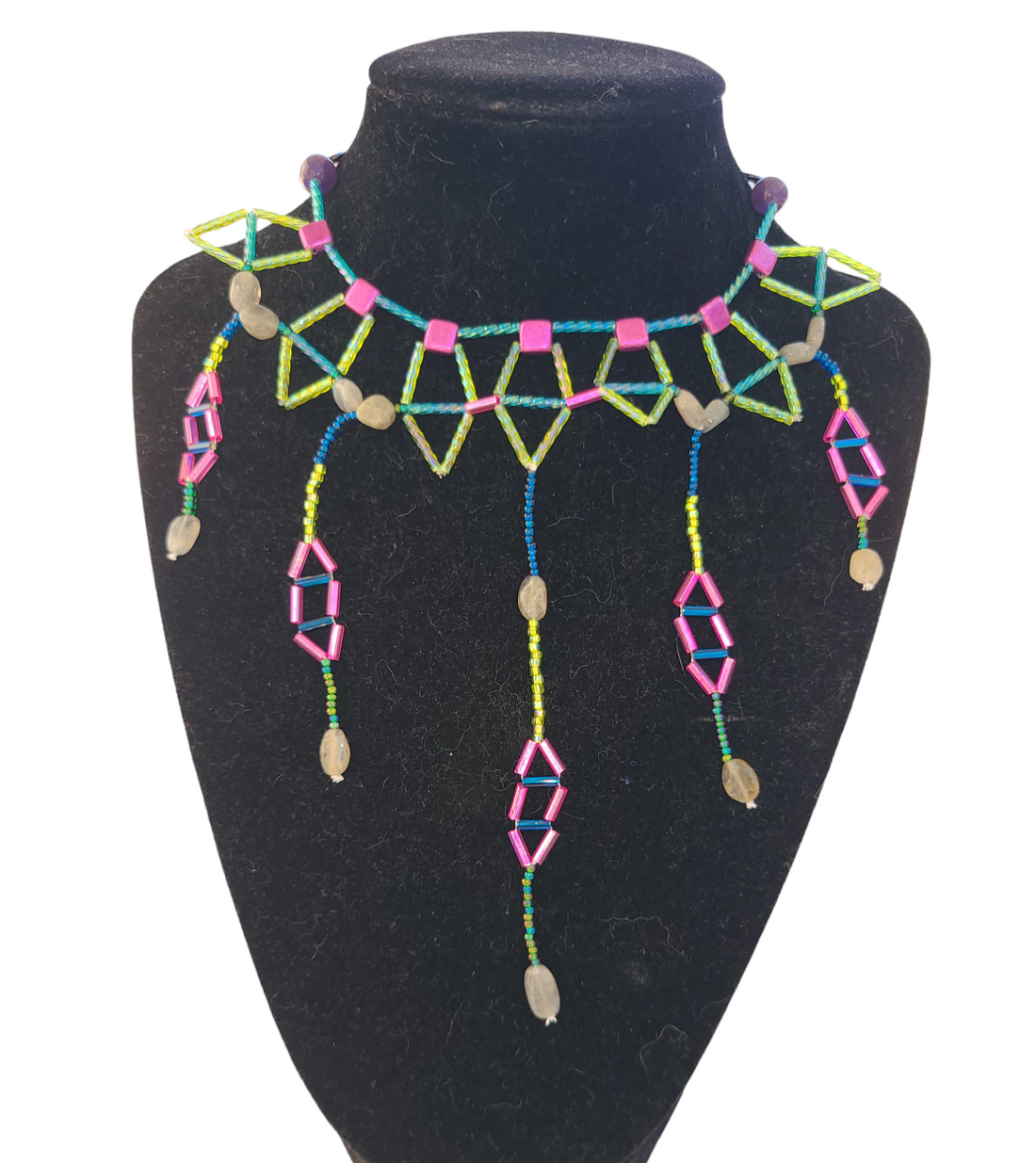
In college, I started to branch out a little bit and made a Triangle Waterfall necklace featuring a range of vibrant summery colors- hot pink, teal, orange, and lime green. I started to diversify a little bit, but focused on similar color shades (e.g. hot pink and orange, etc).
When I was getting married, my husband and I started thinking about a color palette. I knew I wanted to wear a red wedding dress, as a nod to my Indian ancestry (did you know that in India, brides wear red dresses to symbolize prosperity and fertility?). My husband likes deep blues. I perused Pinterest and came up with a fantastic color palette, featuring red tones, as well as a muted periwinkle and a deep blue.

Yes, I made our beaded flowers, as well as my jewelry, including the head piece.
I realized that Pinterest was a gold mine of color inspiration. I started to think back about my junior high art classes, when my teaching talked about using complementary colors, which are across from each other on the color wheel. I’d peruse Pinterest by searching for complementary color palettes- whoa! There’s a whole world out there. People made some spectacular color palettes that I wouldn’t think of, inspired by bird plumage, a sunset, fall color, the ocean, and a whole lot more!
Over the last several years, when I look for color inspiration, the first place I go is Pinterest. When I use gemstones, I try to look for color palettes that work well with a gemstone. For example, I recently did a Stonecrossing bracelet using tree agates. Tree agates make me think of a forest, and we’re in autumn right now, so I looked on Pinterest for autumn forest color palettes and got some great ideas. I came up with a design that features green tones, with gray to represent an autumn sky, and orange, to represent fall foliage.
In the case of crazy lace agate, it can be a little bit more challenging. Crazy lace agate is found only in Chihuahua, Mexico. It is characterized by a distinct swirling pattern, rather than the banding of Botswana Agate. When I recently made a Bohemian Dreamweave bracelet with it, my first though was to do a color palette inspired by a desert. When I looked up desert color palette on Pinterest, I came up with a striking orange, yellow, and blue color palette, inspired by a desert sun against the sand with a deep blue sky. I really liked the result.

Sometimes, like anyone, I love a good neutral piece, and I’ll make a piece in black and white, or in earth tones, like this Botswana Agate Providence Bracelet. What I like about this piece is that the neutral beadwork allows the striking banding on the agates to stand out.
Sometimes, I like to keep it simple with gradients, such as in this Triangle Waterfall necklace, featuring a range of blue/teal tones. Other times, I might just do a single color paired with a neutral.
One thing is for certain- there is an infinite array of surprising color combinations out there! And my jewelry making proves that some color combos work surprisingly well!
Stay colorful
All the best,
Grace


